SEGAL Education Award Site Extension w/ Do Good Be Good
ROLE: Project Manager + Visual Design Lead TIMEFRAME: 2.5 Weeks
Do Good Be Good is a B2B aiming to support Americorps Alumni and Leaders with tools and resources for a brighter future. They offer workshops, webinars, host a podcast and blog and also provide counsel for Americorps Alumni seeking to use their SEGAL Education Award which they receive upon service completion. The problem? At the time, their site didn’t offer any information regarding the Ed Award leaving the team spread thin with meetings covering basic information and less time creating relevant content for Do Good Be Good itself.
Let’s Get You Caught Up
-
AmeriCorps is an independent agency of the United States government that engages more than five million Americans in service through a variety of stipended volunteer work programs in many sectors.
-
The Segal AmeriCorps Education Award is a post-service benefit earned by individuals who complete an approved term of national service in AmeriCorps programs.
There are three ways alumni can use their award: loan repayment, further education, or transferring the award to another person. -
Do Good Be Good helps State Service Commissions and AmeriCorps programs with training and facilitation and provides resources for Americorps Alumni.
Sharon Tewksbury-Bloom, the CEO, is a professional facilitator with extensive experience working with AmeriCorps as a former service member and as an AmeriCorps Project Director. She is passionate about the program and helping alumni be as successful as possible.

Where We Started
Do Good Be Good had previously hired a UX team to create an app educating alumni about the Education Award with a focus on the Conservation Corps subgroup of Americorps. They designed an app that preformed well in testing but Do Good Be Good saw reason to expand their scope beyond the Conservation Corp to all Americorps Alumni. That’s where my team came in. Do Good Be Good was hoping we could build off of the previous’s teams work with the following goals:
1. Create an onboarding process
2. Curate information to specific user needs
3. Make it more “fun” than doing taxes
Our Research
Wait a Minute…
As my team and I began to synthesize the data we collected we started to wonder... Was a mobile app really the answer users were looking for? It certainly didn’t look like it. The data overwhelmingly pointed to a desktop site extension being our most viable starting point. Because Do Good Be Good wasn’t seeking to gain profit from the mobile app, only to provide its users with valuable information, we also questioned whether a mobile app would be a cost effective choice for the business.
All in all, we decided to take a leap of faith and suggest a pivot to our client that would ultimately be better for the users and save her time and a hefty development bill.
Pitching our Refocus
We scheduled a meeting with Do Good Be Good’s CEO, put together all the research and pitched our pivot. We knew there was a huge possibility our client would hold strong to the mobile app idea, especially because of all the work the previous UX team had completed. But as a UX team, our job is to fight for the user’s needs first and foremost! To our relief, Do Good Be Good trusted the research we had completed and gave us permission to move forward with a desktop site instead of a mobile app! We were off!
Meet Our Americorps Grad Allie Eagerton
My team crafted a persona to embody all the interview and survey findings and keep the user in mind while making our site extension
-
Age: 52
Location: Flagstaff, Arizona
Occupation: High School Teacher
-
Allie is an alumna of AmeriCorps who recently completed her service within the last 2 years. When she was nearing completion she remembered about the Ed. Award but didn’t know her options. Since completion, she has had difficulty educating herself on how to use the award and feels like it would be a chore to navigate all the information available. She wants to learn about her options but wants to be excited about the process while having access to relevant information.
-
• Easy access to answers and solutions regarding the Ed Award
• An exciting way to navigate underwhelming tasks and information
• Access to a more tailored process for deciding how to use the Ed Award
-
• Difficulty finding answers to specific questions about the Ed. Award
• Lack of motivation to learn about Ed. Award options
• Too many details that are irrelevant to her specific goals and circumstances
-
AmeriCorps members like Allie need a simple yet engaging way to access relevant information concerning their Education Award options so that they can make informed decisions about their life post-service prior to the award’s expiration.
The Current Journey
To really understand what users like Allie are facing when locating information about using their Ed Award I created a Journey Map to highlight the highs and lows of the process. In this situation, Allie has decided it’s time to use her award following the completion of her service with Americorps. She feels fairly confident she’ll be able to find all the information she needs on the Americorps site, but it’s not quite as straightforward as she was hoping.
Notable Painpoints + Opportunities
Ideating Solutions
When my team and I felt that we had the research and understanding of what paint points were particularly bothersome to our users, we moved forward with ideation and everyone on the team contributed to sketching ideas and pondering the following questions:
How might we increase confidence among users when facing decisions about their Ed Award?
How might we promote excitement and interest from users while they navigate online resources to learn about their Ed Award?
How might we efficiently guide users through an educational experience that is specific to their goals?

The Roadmap Concept
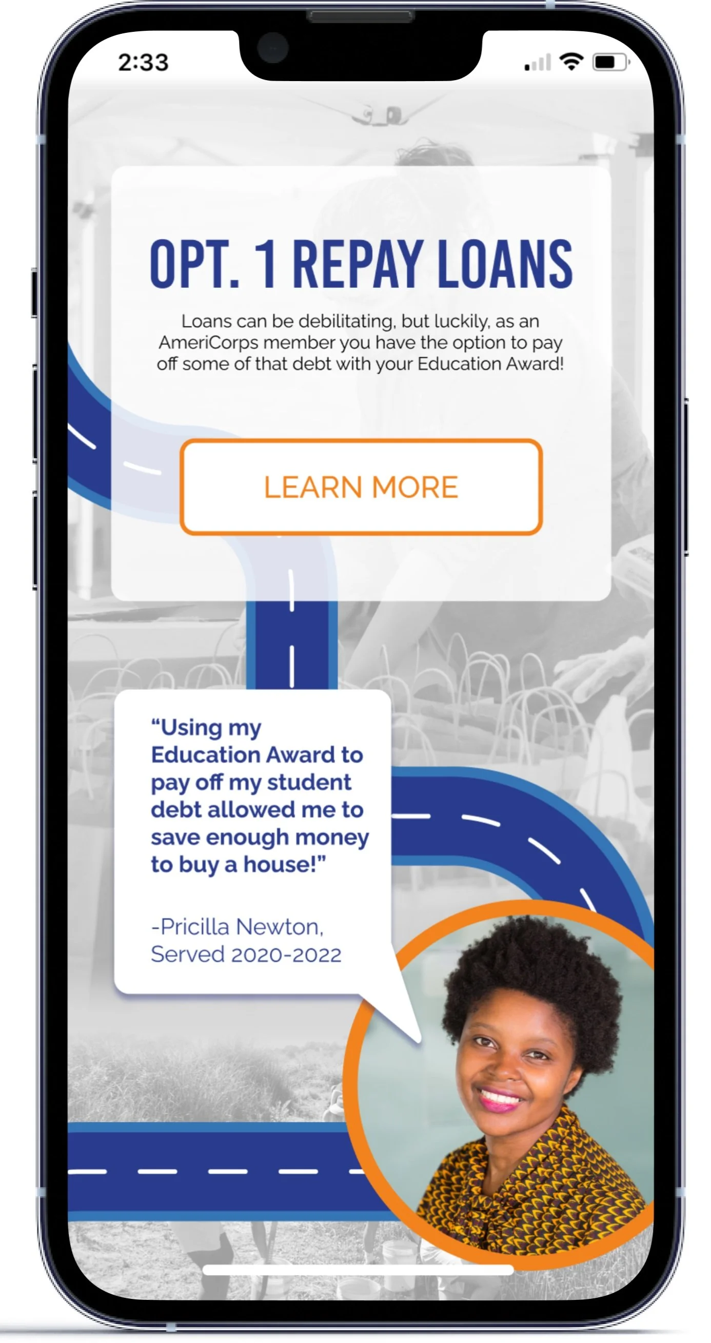
My team and I settled on a “road map” concept I developed with the hope that it would inspire adventure, excitement, and fun. Not only could this concept be a great way to introduce the different Education Award options, but the language used could be transferable to the description of options: navigate your way through tricky tax forms (loan repayment), choose your path to higher education (further education), or let a dependent take the wheel (transfer award).
My team was excited to move forward with the prototype and see how users responded to the concept.
Testing Round One
My team of researchers developed tasks and observed three Americorps Alumni go through our prototype. The results can be found below
Pedal to the Metal!
After making changes based on the test finding, I implemented our final design, ensuring our edition would still feel like a part of the original Do Good Be Good website.
Below you’ll find a video walkthrough of the High Fidelity Prototype
Testing Round 2
My research team gathered six users to test our high fidelity prototype. The tasks were the same as our first round of testing. You’ll see the results below!
Summary of Next Steps
After concluding the testing for the high fidelity prototype, our test finding results and immediate next steps can be summarized as the following
1. More comprehensive research regarding language accessibility to ensure seamless navigation regardless of a user’s prior knowledge of Americorps and the Education Award
2. Ensure the site has multiple access points for contacting and setting up a meeting
3. Although not explicitly mentioned in testing, ensure all external links are accurate and provide relevant information to users not provided on the Do Good Be Good site.
Further Recommendations
Mobile Optimization
Given the time constraints, my team was not able to test or design a responsive site but we believe it is important to ensure all desktop sites are accessible via mobile devices.
Chat Bot
Depending on Do Good Be Good’s availability regarding meetings and commonly asked questions, it may benefit the team to have a chat bot to answer common questions and decrease the amount of time team members are spending in meetings
Lessons Learned
Project Manager
This project was my first time acting as project manager and it was a great experience. I was very lucky to have a team that was eager to do their respective parts, learn from each other, and be fully engaged with the project.
I learned a lot about the importance of delegating tasks and trusting my team to do their parts. As a recovering perfectionist, this hasn’t always been easy for me to do but I think I did it well with this group. In the future when I take on this role again, I want to ensure expectations and roles from the beginning. Even though I practiced this with the team, I want to walk into the next project feeling more confident and sure about those expectations.
The Project
I think my team as a whole learned a lot about the importance of research and user testing. Especially during our second round when our success rates started to decrease. As a designer, I’m learning more and more every day to not take poor testing results of my design work personally. It used to make me feel like a failed designer, but I’m starting to see it as a challenge and an interesting puzzle to solve.
I felt like this project went very well. I learned so much about leaning into team members’ strengths and learned so much about the power of group thinking and brainstorming. I really enjoyed working on a team with diverse talent.


